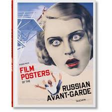
This is one of the most important parts of a film in general. Not only is this the first impression, it's what would hypothetically be what associates everyone with this film. Before I commence the actual research I already know one of the colors I want to have a major part in this film is blue. Although it can be the color of serenity and control I want it to demonstrate the feeling of loneliness. I’ll worry about the technical difficulties with that later but for now that's the plan.
For the first video it wasn’t exactly ‘a how to’ but more so of a ‘what to’. It did give me ideas for the key art and the social media promotional posts in the future. Playing with the lighting and overlapping voices definitely aligns with the film’s experimental nature and can cause people to gain an interest early on.
The next resource was a school’s website: that mandated that posters must be at least 32" x 44" in size, but no larger than 36" x 48." Other hand, the rest of that stuff was for the students so I figured I’d look for a better guide.
Found it! This website was a lot more direct with their information and had the dimensions I was looking for–more or less. I really want something that will tell me the correct dimensions for the credits and whatnot. But this was probably the most helpful: it offers a template, the dimensions for different social media platforms, and other websites that can work with photoshop.
До свидания


No comments:
Post a Comment